In this second part of my tutorial we will be building the CSS and JavaScript code and do the necessary steps for responsive webdesign to create this beautiful HTML5 responsive website. Be sure to have worked through the first part of the tutorial where we have built the basic HTML structure and included all necessary scripts.
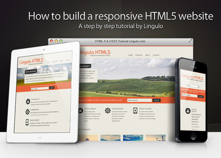
We have already included our CSS Reset in the last part of the tutorial. The Reset will take care of any differences in the default styling of HTML elements by simply resetting all the CSS values. That way we can start creating the styling from scratch but we need to have in mind that e.g. paragraphs will no longer have a browser predefined padding so we have to manually define every value.
Creating the styling – Defining the global rules
When creating the stylesheet it is important to always use comments for the different sections of the CSS file. The first section is the global or general section where we will put all stylings which are used on your whole website and mostly remain unchanged. The first element we are gonna style is the body element. As you can see on our website preview there is an orange stripe on top of the page. This stripe is created by a 5px thick top border defined in our body element rule. Let´s also define our website background color and our general font family and font color.
body

{border-top: 5px solid #e56038;

	background: #ebe8de;

	font-family: 'Open Sans', sans-serif;

	color: #333333;}
Next element we want to style is our input fields. As we would like the input fields to look the same on any further page of our website we will put the input styling into our global section of the CSS file. In our website example we only have two different kinds of input fields: a text input field and a submit button. Due to that reason we will create a general input rule which will cover the styling for all the different kinds of input fields and a second rule only for our submit button.
If you look at the CSS code for our input fields you will probably note that we are using CSS3 features without defining prefixes for the different browsers (-webkit, -moz etc.). As already mentioned in the last part of this tutorial we use a script called Prefix Free which automatically rewrites the CSS rule depending on the browser used by the visitor. That way we can use CSS3 properties by simply adding the general rule (e.g. just box-shadow instead of -moz-box-shadow, -webkit-box-shadow and box-shadow).
input

{font-family: 'Open Sans', sans-serif;

	font-size:16px;

	padding: 7px;

	outline: 0;

	border:0;

	width:250px;

	background: #EBE8DE;

	border-radius:5px;}


input[type=submit]

{width:auto;

	padding: 5px 18px;

	line-height:25px;

	text-shadow:none;

	cursor:pointer;

	box-shadow: none;

	background: #333333;

	color: #fff;}
Next let´s add rules for our paragraphs and anchors. As we have removed all styling by using the reset.css we now need to define our margin (or padding) and line-height manually for the paragraphs. The anchors should inherit their font color from the parent element and change it by fading it from one color to another. To do so we use the CSS3 feature transition (for further information on transitions please read my blog post). Since we have removed all predefined CSS styling we also need to define our strong elements. In our case they should just be displayed in bold.
p

{margin: 5px 0;

	line-height: 25px;}


a

{text-decoration: none;

	color: inherit;

	transition: color .5s ease;}


strong

{font-weight: bold;}
We have three rules left in our general section of the CSS file. The first one is the rule for our figcaption element. As mentioned in the previous part of the tutorial a figcaption is useful in conjunction with the figure element to mark up images or diagrams. In our website the figure element is used for our four little images. To emphasize the heading of our caption a bit more and to add the line between caption title and caption text we will now add a CSS rule for our strong element inside the figcaption.
figcaption

{line-height: 25px;

	font-size:14px;

	width:200px;}


figcaption strong

{border-bottom: 1px solid #D6D0C1;

	padding-bottom:10px;

	margin: 10px 0;

	display:block;}
Creating the styling – Defining the section rules
Now that we have finished creating the general CSS rules let´s start defining the rules for our different sections of the website from top to bottom. To make our website responsive we will set the width property to auto and define a max-width of e.g. 900px for each section on our website. What this does is leaving the sections at 900px width when the browser window is wider than 900px. However when the browser width gets smaller than 900px the width of our sections will adapt to the browser´s width.
As we would like the sections to be horizontally centered we will set the margin-right and margin-left property to auto (see an example here). Centering elements like that is however not supported in Internet Explorer 5. As a solution you could set the body element´s text-align property to center. I personally won´t even bother as IE 5 is almost not used anymore at all.
Let´s start now creating the rules for our different sections of our website. The first section to style is our header. On a real website with several pages you might have multiple header elements so you would need to give the main header a class or an ID to create specific rules only for that element. In our case though since we only use one header element on our entire website we will just add a rule for all header elements and a rule for all paragraphs and h1 headings inside a header.
header

{

	position:relative;

	width:auto;

	max-width:900px;

	margin: 0 auto 20px auto;}


header h1

{margin: 35px 0 0 0;

	font-size: 55px;

	color: #e56038;

	font-family: 'Baumans', cursive;}


header p

{font-family: 'Open Sans', sans-serif;

	font-size: 16px;

	color: #4A463B;

	margin-left:132px;}
For our main navigation we used the new HTML5 nav element. Since we have added the CSS property position: relative to the header element we can now use position: absolute to position the navigation at the right bottom corner of our header.
For our unordered list which contains all the navigation links as list items we will remove the default list style (the little dot next to each list item). Our list items should not be positioned one below the other but next to eachother. To do so we will make each list item float and add a padding to create a space between each of them. For the anchors within our list items we will define a font type and color and set text-transform to uppercase to make all letters uppercase. Also add a transition of 0.25 seconds and define a color in the hover state. This way the links will fade from one color to another when hovering them.
nav ul

{list-style:none;}


nav ul li

{display:block;

	float:left;

	padding:3px 15px;}


nav ul li a

{font-family: 'Open Sans', sans-serif;

	text-transform: uppercase;

	transition: all .25s ease;}


nav ul li a:hover

{color: #E56038;}
The next section to style is our slider-image section (don´t forget to write the section as a new comment into your CSS file to make it more clear). Just like in the example file of the Slides script we set the container width to auto to make the slider images resize depending on the browser´s width. The div “slides” needs to be hidden with CSS as it will be made visible by the Slides script. Also add a border to the div with the class “slidesjs-container” to prevent the slideshow from flashing on load. Our slider content is positioned absolutely within our slider container and gets a z-index higher than the one from our container to make it overlay the slider images. As we want to show only slider_content1 at the beginning when loading the site we will set display to none for all slider content boxes except of slider_content1.
#slider_content1, #slider_content2, #slider_content3

{line-height: 25px;

	font-family: 'Open Sans', sans-serif;

	width:350px;

	position:absolute;

	top:15%;

	left:15%;

	display:none;

	z-index:11;}


#slider_content1

{display:block;}


.container

{width:auto;

	margin: 0 auto;

	position:relative;}
Now that we have styled the wrapper for our slider content let´s add a styling to the headings and paragraphs inside our slider_content1, slider_content2 and slider_content3. To create the effect of two rounded borders simply add 0 to the borders you don´t want to be rounded into our border-radius property. The order for the values inside that property are top-left, top-right, bottom-right, bottom-left.
For our property display we choose inline-block which displays our headings inline but will preserve the capability to style them just like block elements (setting width and height, margin, padding and so on). The advantage over just using block instead in our case is that the dark background of the heading will be as wide as the heading text itself and not as the surrounding element.
For the paragraphs we will define the same padding as for the heading to make it look in a line and set a bottom margin to create a space between the paragraph and the “Read more” button. You can also set a small border-radius to make the borders of the paragraphs a bit round.
#slider_content1 h3, #slider_content2 h3, #slider_content3 h3

{color:#EBE8DE;

	font-size:25px;

	font-weight:bold;

	margin-bottom:10px;

	background-color:#333333;

	padding:10px 15px;

	border-radius: 15px 0 15px 0;

	display:inline-block;}


#slider_content1 p, #slider_content2 p, #slider_content3 p

{margin:0 0 30px 0;

	color:#4a463b;

	background-color:#EBE8DE;

	padding:10px 15px;

	border-radius: 5px;}
Now that we have finished the CSS part of our slideshow let´s move on to the next section, our orange “spacer”. We set the width to auto to make it fill the whole width of the surrounding element (which is our body element).
To position the question text which is wrapped inside a paragraph we can´t just define a fixed procentual value for our left property. If we did so the question would move to different positions depending on the browser´s width and would not stay fixed at a certain position. The solution is to set the paragraph´s position to absolute and the left property to 50% which positions the paragraph in the middle of our spacer. Then add a negative margin-left to move it a bit more to the left side. This way the paragraph will always stay at the same position regardless of the browser´s width. To position our search form we do the same thing. Note that we don´t need to style our form elements as we have already added a general styling in the global/general part of our CSS file.
#spacer

{width:auto;

	height:70px;

	background-color:#e56038;

	position:relative;

	font-family: 'Open Sans', sans-serif;

	color:#fff;

	font-size:18px;}


#spacer p

{margin-top:22px;

	width:auto;

	position:absolute;

	left:50%;

	margin-left:-450px;}


#spacer .search

{margin-top:15px;

	width:auto;

	position:absolute;

	right:50%;

	margin-right:-480px;}
Our next section consists of three articles each with an image, a heading and a paragraph. Again we need to set the width of our “boxcontent” to auto to make the width respond to the browser´s width and set a max-width to limit the maximum width. To make the section centered we again use an auto margin to the left and to the right. To create a little space to the top and bottom we set a padding. As we want the articles to be positioned next to each other let´s make them float, set a fixed width and create a little space between them by setting a margin-right. Inside the articles we let the icon image float to the left in order for the text to be placed directly next to the icon and not below it. By floating the icon the heading will now be placed next to the icon image but the text which is placed in a paragraph will only stay next to the image as long as the image is still there. As soon as the text exceeds the height of the image it will continue at the left border of our article below the icon. To fix this we need to define a margin-left for the paragraph to make it vertically in a line with the heading.
#boxcontent

{width:auto;

	max-width:900px;

	margin:0 auto;

	padding:70px 0 45px 0;}


#boxcontent article

{float:left;

	width:250px;

	margin-right:45px;

	font-size:14px;}


#boxcontent article h3

{font-family: 'Open Sans', sans-serif;

	font-size:20px;

	margin-bottom:10px;

	margin-left:75px;}


#boxcontent article img

{float:left;}


#boxcontent article p

{line-height:25px;

	font-family: 'Open Sans', sans-serif;

	margin-left:75px;}
For the next two sections we will combine two rules in order not to have to write it two times. For both the section “four_columns” as well as the section “text_columns” we set the font, the line height, the width etc. as well as define the styling of the h2 and h3 headings.
#four_columns, #text_columns

{line-height:25px;

	font-family: 'Open Sans', sans-serif;

	width:auto;

	max-width:900px;

	margin:0 auto;}


#four_columns h2, #text_columns h3

{font-size:20px;

	border-bottom: 1px solid #D6D0C1;

	padding: 20px 0;

	margin-bottom: 20px;}
Just like in the last section we also let the articles within “four_columns” float to position them next to each other. To create the effect when hovering the thumbnail images we will first set display to block for the anchors inside our articles. We want them to be displayed as block elements as they should adapt its own size to the size of the elements inside of it and fill the whole height and width of our thumbnail image. Also set the position to relative in order to be able to position the span element “thumb_screen” absolutely inside of it. This span element will be displayed on top of our image and shows the little zoom icon and a dark background on mouse-hover. We need to position it absolutely in order to make it lay on top of the image. With a relative position the span element would be displayed above the image. To create the half transparent background we will set the background color to black and add the zoom icon as background image (vertically and horizontally centered). Then we set the opacity to 0 to hide the span element by default. To let the span element fade from invisible to visible we will add the CSS3 feature transition (more about it in my other blog post) for the property opacity. In the hover-state of the span element we set the opacity to 0.5 to make it 50% transparent on mouse-hover.
#four_columns .img-item

{float:left;

	margin-right:25px;}


#four_columns .img-item a

{position:relative;

	display:block;}


.thumb-screen

{display:block;

	position:absolute;

	top:0;

	left:0;

	width:100%;

	height:113px;

	background: #000 url(img/zoom.png) center center no-repeat;

	z-index:99;

	opacity: 0;

	transition: opacity .5s ease;}


.thumb-screen:hover

{opacity:0.5;}
The next section consists of two columns, one article and one section which should float next to each other. Each of the two columns should have half the width of the website width of 900px. To move the second column a bit more down to be vertically centered with the first column we define a margin. The section “column2″ contains two articles which should each have a relative position in order to be able to absolutely position the rocket and clock icons.
#text_columns article.column1, #text_columns .column2

{margin: 70px 0;

	font-size:14px;

	float:left;

	width:450px;}


#text_columns .column2

{margin: 120px 0;}


.row

{position:relative;

	margin: 40px 0 0 50px;

	float:right;

	width:350px;}
As a little gimmick we will now create the CSS animation which starts when hovering the rocket and clock icon. Whether or not this is a useful feature depends on your site and what you would like to achieve with the animation. Note that CSS animations will not be supported by every browser and might in some cases lead to unexpected behavior (for example might the rocket in some browsers disappear on mouse-hover).
When hovering the rocket we want it to fly to the top right and fade out. So let´s set the opacity to 0 on mouse-hover and define a transition for the opacity. We want it to fade out within 0.4 seconds after a delay of 0.2 seconds. To do so add the delay as last value into our transition property. Now that the rocket will fade out on mouse-hover let´s add the path animation. In order not to have to set all the keyframes manually we will use the tool Stylie to create a path from the bottom left corner to the right top corner. Simply copy the CSS code inside the class “stylie” generated by the tool into our rocket:hover rule. Then create a new section “keyframes” at the end of your CSS file where you add the keyframe rule (the part starting with “@keyframes stylie-transform-keyframes”). You might need to adapt the translateX or translateY property to match the starting point of your rocket with the rocket icon (if you don´t change the values manually your rocket might start not exactly from where the rocket image was before hovering it). Just play around with the values to make it look somehow realistic. Also be sure to set the value for animation-iteration-count to 1 so that the animation will occur only once on mouse-hover and the rocket doesn´t fly infinetely.
For the clock icon we want the animation to look just like a ringing alarm clock. To achieve this we will again use Stylie to create a horizontal path and then set the animation-duration to about 100ms. Also set the animation-iteration-count to infinite to make the animation repeat endlessly. Please note that we need to change the name of our keyframe rule as the name “stylie-transform-keyframes” has already been used for our rocket keyframes.
.rocket:hover

{opacity:0;

	transition: opacity 0.4s ease 0.2s;

	animation-name: stylie-transform-keyframes;

	animation-duration: 700ms;

	animation-delay: 0ms;

	animation-fill-mode: forwards;

	animation-timing-function: linear;

	animation-iteration-count: 1;

	transform-origin: 0 0;}


.clock:hover

{animation-name: stylie-transform2-keyframes;

	animation-duration: 100ms;

	animation-delay: 0ms;

	animation-fill-mode: forwards;

	animation-timing-function: linear;

	animation-iteration-count: infinite;

	transform-origin: 0 0;}


/* KEYFRAMES */


@keyframes stylie-transform-keyframes

 {0%

{transform:translateX(30px) translateY(46px) rotate(0deg) translate(-50%, -50%);

animation-timing-function: cubic-bezier(.25,.25,.75,.75);}

100%

{transform:translateX(260px) translateY(-150px) rotate(0deg) translate(-50%, -50%);}}


@keyframes stylie-transform2-keyframes

{0%

{transform:translateX(40px) translateY(40px) rotate(0deg) translate(-50%, -50%);

animation-timing-function: cubic-bezier(.25,.25,.75,.75);}

100%

{transform:translateX(50px) translateY(40px) rotate(0deg) translate(-50%, -50%);}}
We have reached the footer of our website. As we want it to fill the whole width of the body element and have a fixed height we set the width to auto and define a height value. Also be sure to add position:relative again in order to be able to position the copyright section at the bottom of our footer.
Inside our footer we have another section with a class “wrapper” which should have an auto width and a max-width of 900px just like the other sections in our website. This will make sure that the footer content will change its width depending on the browser´s width.
The three columns inside the footer should be next to each other so we will float them and set a different font color in order for the text to be visible on the dark background. The column in the middle (second column) consists of several list items with a little arrow icon. Each of the list items has a padding and a border-bottom. To move the list items a bit down and create a symmetric look we use margin-bottom. For the arrow icon we set a background image and position it left and 6px from the top. As we have defined a padding the text will not overlap the icon.
footer

{position:relative;

	clear:both;

	width:auto;

	height:350px;

	background:#333333;}


footer .wrapper

{line-height:25px;

	margin: 0 auto;

	padding-top:30px;

	width:auto;

	max-width:900px;

	font-size:14px;}


footer .wrapper .column

{font-family: 'Open Sans', sans-serif;

	color:#ababab;

	float:left;

	width:280px;

	margin-right:20px;}


footer .wrapper .column.midlist ul li

{width:auto;

	padding:0 0 10px 25px;

	margin-bottom:10px;

	border-bottom: 1px solid #444444;

	background:url(img/arrowright2.png) left 6px no-repeat;}


footer .wrapper .column.midlist ul li a:hover

{color:#fff;}
In the right column we will set display to block for the span elements inside the list items. We want the text inside our span element to be displayed as block element in order to create a margin between the little image and our text. We float our image in order to position it next to the text. Since our span element containing the text is displayed as a block element we need to define a margin-left starting from the left border of our ul element to create a space between the image and the text. For our images we will define a border and a transition for our border which will make sure the border color fades from one color to another on mouse-hover.
For our h4 headings inside the footer we set a font color which looks good on the dark background and define a bottom border just like we did for the previous headings.
footer .wrapper .column.rightlist ul li

{width:auto;

	margin-bottom:15px;}


footer .wrapper .column.rightlist ul li a span

{margin-left:95px;

	display:block;}


footer .wrapper .column.rightlist ul li a img

{transition: border .25s ease;

	float:left;

	border:3px solid #444444;}

footer .wrapper .column.rightlist ul li a img:hover

{border-color: #5e5e5e;}


footer .wrapper .column h4

{font-size: 16px;

	color: #fff;

	border-bottom: 1px solid #444444;

	padding: 0 0 10px 0;

	margin-bottom: 10px;}
Now that we have styled the footer let´s position our copyright notice at the very bottom of our footer. If you have a look at the HTML code you will see that we have a div with the ID “copyright” which we will position absolutely at the bottom of our footer and give it a slightly darker background color. The width of this div should be similar to the width of our footer so we will set the width to 100%.
Inside our copyright section we have a div with the class “wrapper”. We do not have to set the width or the max-width for it as we have already defined a rule footer .wrapper which will apply. However we need to set the font color and font type, define a padding and set the position to relative to be able to position our social button links absolutely within the wrapper. The div with our social links should be positioned at the right corner and 25px from the top of our wrapper.
If you have a look at the HTML code you will see that our social buttons are simply made by wrapping an anchor around an image. As the links are positioned next to each other we need to make them float just like we did several times before. To achieve the hover effect we will simply set the opacity to about 30% and then to 70% or even more on mouse-hover. To make it fade smoothly from 30% to 70% opacity we define a transition.
#copyright

{background: #1D1D1D;

	height:70px;

	position:absolute;

	bottom:0;

	left:0;

	width:100%;}


#copyright .wrapper

{font-family: 'Open Sans', sans-serif;

	padding-top:25px;

	color: #5e5e5e;

	font-size:14px;

	position:relative;}


#copyright .wrapper .social

{position:absolute;

	right:0;

	top:25px;}


#copyright .wrapper .social a

{transition: opacity .25s ease;

	opacity: 0.3;

	margin-left: 12px;

	display:block;

	float:left;}


#copyright .wrapper .social a:hover

{opacity: 0.7;}


#copyright .wrapper a

{color: #ABABAB;}


#copyright .wrapper a:hover

{color: #fff;}
The next section in our CSS file is called “MISC” and will contain different rules which you don´t know where to put them else. For our website we need to define two rules inside this section. In the HTML code you will find several br with a class “clear”. These are necessary to clear the floating which we used to horizontally position elements next to each other. Simply try not setting the class and you will see why we need it.
The second rule we still need to define is for our hidden headings. As mentioned in the previous part of this tutorial we need to define a heading for each section in our document to create a proper HTML5 outline. Since displaying these headings does not always make sense we will hide all elements which have the class “hidden” by using the CSS property clip.
.clear

{clear:both;}


.hidden

{position:absolute;

	clip: rect(1px 1px 1px 1px); /* IE6 & 7 */

  	clip: rect(1px, 1px, 1px, 1px);}
Creating the styling – Making it responsive
We have finished styling our website and it should look just like in the website preview. The only difference is that the website we just created is not yet entirely responsive. We have already set our width to auto and defined a max-width for our sections. However this will only change the width of our sections but the content inside these sections might be wrong positioned or overlapping. We will now use CSS Media Queries to specify certain rules for different browser window sizes. I will not cover the topic media queries in detail, if you want to know more about this topic check out the web developer guide. In our website we will only use the max-width attribute for our media queries which defines the maximum width for the rule to take effect. So if you define a rule with a max-width of 500px then this rule will take effect as long as the viewport width is smaller than 500px or exactly 500px.
To make our website responsive we need to first of all think about what content is relevant and should be displayed on small displays like mobile phones or on tablets. When creating a website you need to already have in mind how it should look on a mobile phone at the very beginning of your development phase.
Start reducing the width of your browser window until you detect that some parts are wrong positioned or just don´t look good. In that case the easiest way to determine the current width of the website is to use your browser´s web development tool to get the width of the body element. For that width we then need to define a media query to somehow change the layout of our website and make it look good again. However note that the width defined in our media queries can vary depending on the browser you are using. In Firefox the vertical scrollbar gets included in the viewport width which means that if you define a media query with a max-width of 1000px then in Firefox the media query rules will occur at about 985px. The 15px wide scrollbar is subtracted from the max-width. To read more about that topic check out this blog post. The solution for this problem in our case would be to just use a buffer and simply set our max-width a bit higher than necessary.
On our website the first thing you will notice when changing the width of your browser window to about 1215px is that the “Read more” button in our slider is likely to overlap the spacer. How can we get rid of this problem? One way is to completely remove the button (set display to none) and put the “Read more” behind our paragraph as plain text. That way we will already save some space. To do so we still need to add some HTML code to our file. Add an anchor behind each of the paragraphs inside our slider content boxes and give it a class “responsive_button”. Then add a rule into your CSS file to set display to none for all elements with a class “responsive_button” inside a paragraph inside a slider content box.
#slider_content1 p .responsive_button, #slider_content2 p .responsive_button, #slider_content3 p  .responsive_button

{display:none;}
In our media query rule we now need to simply set display to inline to display it inline behind the paragraph text and define a font color.
However there is still a problem since the text inside our paragraphs is still overlapping the orange spacer. What we could do here to solve this is to make the slider content wider. To do so we set its width to auto to make it adapt to the parent element and give it a margin-right to create a free space between the slider content boxes and the right edge of our slider images. Also we want the font size to be smaller which will save some space and looks a bit lighter.
@media (max-width: 1215px)

{#slider_content1, #slider_content2, #slider_content3

{width:auto;

		margin-right:50px;}

#slider_content1 h3, #slider_content2 h3, #slider_content3 h3

{font-size:18px;}

#slider_content1 p, #slider_content2 p, #slider_content3 p

{font-size:14px;}

#slider_content1 p .responsive_button, #slider_content2 p .responsive_button, #slider_content3 p  .responsive_button

{display:inline;

color:#000;}

.container .button

{display:none;}}
When reducing the width even more you will notice that when we get below the max-width of 900px which we have set for our website the floated articles will not be next to each other anymore. To get rid of the Firefox scrollbar problem I told you about we will add 15px and define a media query for a max-width of 915px. Since thearticles don´t fit next to each other anymore we will position them one below the other horizontally centered. To do so we need to remove the floating and set margin-right and margin-left to auto. Also we change the width to 60% to make it change its width depending on the website´s width.
We also have the problem that below 900px the orange spacer with the search form will not fit anymore. To solve this let´s change the font size of the spacer and the input field, reposition the paragraph with the question text inside and change the size of our input field by adjusting the padding values.
Another problem occurs with the section “four_columns”. Below 900px some of the articles with the class “img-item” might wrap and overlap the other articles. To solve this problem we will set a specific width to our section so that two articles wrap to the next line. Then we define a margin-top for the two wrapped articles to create a space between the two lines. To address only the third and fourth article (which are the ones in the second row) we will use the CSS3 feature nth-of-type. Note though that this will not work in IE8 or below. If you want to assure full browser support you could give a specific class to the third and fourth article instead.
For the section text_columns we also need to reposition the articles. To do so let´s remove the floating and change the width of the two columns by overwriting the value for max-width. To center the articles within the section we will set margin-left and margin-right to auto just as we did several times before. We also don´t want the two articles inside the second column (the ones with the rocket and the clock icons) to be floated right anymore and need to readjust the margin to make it look good.
The last section we need to adjust at 900px is the footer. To make it fit the smaller width of our website we will reduce the font size and the width of the three columns.
@media (max-width: 915px)

{#boxcontent article

{float: none;

		margin: 30px auto 0 auto;

		width: 60%;}


#spacer

{font-size:15px;}


#spacer .search

{margin-top:19px;

		margin-right:-385px;}


#spacer p

{margin-left:-370px;}


input

{padding:4px;

		font-size:14px;}


input[type="submit"]

{padding: 1px 14px;}


#four_columns

{width: 500px;}


#four_columns .img-item:nth-of-type(3), #four_columns .img-item:nth-of-type(4)

{margin-top: 25px;}


#text_columns article.column1, #text_columns .column2

{float:none;

		max-width: 500px;

		margin: 50px auto 0 auto;}


.column2 .row

{float:none;

		margin:0 0 40px 50px;}


footer .wrapper .column

{font-size: 12px;

		width: 230px;}}
When reducing the width of your browser even more you will notice that at some point the slideshow is just too small and does not look good anymore. To remove it we will set the top value to a high negative value to make it disappear. We can not use display to remove it because the slideshow will not appear again if it has been removed. As the slideshow has disappeared the orange spacer will start overlapping our navigation so we need to define a fixed height for our header. We can also reposition our navigation because now that everything has been centered it might look better to center the navigation as well. To center it we first need to overwrite our top and bottom values by setting them to auto. Then we set the left attribute to 50% and define a negative margin corresponding to half of the navigation´s width.
We also got some issues concerning the spacer. The search form and the paragraph do not fit next to each other anymore so we need to position them below each other. We define a fixed height for the spacer and setmargin-right and margin-left to auto to center it. To get rid of any margin and the left value we will set the position to static. By defining a padding we create some free space above and below the paragraph. Just as we did for the paragraph we will do the same for our search form.
Because our footer does not fit anymore we will position the three columns of our footer below each other. To achieve this we first need to set the height to auto as it has been set to 350px before. Then we set a fixed width to the wrapper inside the footer and center it. The three columns inside the wrapper should not float anymore as they should be positioned below each other. We also set the width to auto in order to make it fill out the whole width of the wrapper. Since there is not a lot of space in the footer we will completely remove the social links.
@media (max-width: 765px)

{.container

{top: -1500px;}


header

{height:120px;}


header nav

{right: auto;

		bottom: auto;

		left: 50%;

		top:100px;

		margin-left: -184px;}


#spacer

{height:100px;}


#spacer p

{text-align:center;

		position:static;

		margin: 0 auto;

		padding:15px 0 7px 0;}


#spacer .search

{text-align:center;

		position:static;

		margin: 0 auto;}


footer

{padding-bottom:70px;

		height: auto;}


footer .wrapper

{width: 350px;

		margin: 0 auto;}


footer .wrapper .column

{margin-top:30px;

		float:none;

		font-size: 14px;

		width: auto;}


footer .wrapper .social

{display:none;}}
At about 500px we will again adapt the layout of our website. The section “four_columns” will now display the articles below each other. We do not need a fixed width anymore so we can set it to auto. As we don´t want the articles inside our “four_columns” section to be next to each other anymore we will remove the floating and define a fixed width.
For our wrapper inside the footer and the rocket and clock articles we set the width to auto in order to make it adapt its width to the parent element. Unfortunately our navigation is too wide as well so we need to think of a solution. We could of course divide it into two parts which we position below each other but I find it better to completely remove the navigation and replace it with a simple select box. To achieve this we add the HTML code for a select box into the header of our website and give it an ID “alternative_menu”. We then set display to none to hide it by default and position it absolutely somewhere below the subheading paragraph. In our media query we will then set display to block to make it appear when the navigation gets hidden.
If you look at the website again and reduce your browser´s width you will see that the website will now respond to the changing width and look good at any screen size. Obviously you can always do more to make the website look even better on different screen sizes. Just play around a bit with the values and add rules for any element you want to change at a specific screen size.
The following parts of the tutorial have not yet been completely finished, please check again in a few days. Thank you!
Creating the JavaScript – Coding the slider content
Now that we have finished our styling we will create the JavaScript code for our slider content boxes to appear and disappear when the slider image changes.
Creating the JavaScript – Coding the alternative menu
– under construction –
Additional features – Creating skiplinks
– under construction –
The post How to build a HTML5 website from scratch – Part 2 appeared first on Lingulo.com .