Required knowledge level: intermediate
Please note: This tutorial is still in construction and has not been finished yet. You can however already start reading and come back later again.
If you are a reader of this blog you will surely have read my previous tutorial on how to build an adaptive HTML 5 website. In the previous tutorial we created a website from scratch and we did it the manual way without the use of any framework or grid system. Personally I think it is very important to first learn how to code a website all by your self without using a framework which will take care of many things for you. So be sure to first read through my previous tutorial before continuing here.
Purpose of this tutorial
In this tutorial I will teach you the way a professional web developer would create a website. I will give you instructions on how to install and use the necessary tools to create websites in a fast and professional way. I will then create a responsive website with you using the popular CSS framework Bootstrap. You can have a look at what we will be creating here. We will also take care of optimizing the website for production and improve page loading time especially for mobile devices.
At the end of this tutorial you will hopefully be able to create great responsive HTML 5 websites using professional approaches that look good on any device. You will also understand how to improve your website to load faster.
So let’s get started creating a modern beautiful responsive HTML 5 website!
Choosing a boilerplate and workflow framework
A boilerplate and workflow framework helps you build websites much faster and easier. It gives you a good starting point from which you can concentrate on your actual goal “building a website” instead of having to first set up your system manually. It can help you with certain tasks like checking your JavaScript code, auto prefixing your CSS rules or concatenating and minifying your files.
There are many different boilerplate and workflow frameworks out there which mainly differ in the selected tools (e.g. Gulp vs. Grunt vs. Webpack) and languages (e.g. SASS vs. Stylus vs. Less). Some of them are built really complex and offer a huge variety of possibilities and features. It mainly depends on your project as well as your personal preference which framework you want to use. Many people also first start using a workflow framework, then change it to fit their needs better and from that day on use this modified version instead.
In this tutorial we are going to use Fastshell, a boilerplate and workflow framework inspired by Fireshell (which is a bit obsolete now). Fastshell offers some of the most important features you will love to use from this day on. On the other hand it is still very simple and easy to understand and therefore perfect for beginners also.
Installing the necessary tools
So let’s get started! Before we can use Fastshell we first need to install several tools and frameworks. The first thing we need to install is the JavaScript framework Node.js. Node.js is a minimal framework for JavaScript allowing you to write JavaScript code on the server-side. We need to install Node.js in order to be able to use the Node Package Manager (NPM). NPM basically is a place where you can find all kind of different JavaScript packages and simply use them in your project by adding their package name to a certain file called package.json. We are going to learn more about this file at a later point in this tutorial.
Installing Node.js
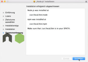
As I said in order to use NPM we need Node.js. So let’s go to the Node.js website and download the LTS (long term support) version of Node.js by clicking on the big green button. Once finished open up the downloaded file and click on the “Next” button multiple times to install Node.js. Note that you might get prompted to enter your administrator password.
Once successfully installed you should see a window similar to the one on the image. In order to check whether Node.js is installed successfully open up command shell. A command shell is a window into which you can enter commands which will be executed by your system (probably Windows or Mac). By using a command shell you have a lot more possibilities than you have when simply using a mouse.
If you are using Windows please press Win + R to open up the Run dialog box. Now type in cmd and press enter. A new command window should open now and you can use this window to execute commands.
If you are using Mac please either click on the magnifier icon in the top right corner or hold the cmd button and click on the space bar. Now type in Terminal and press enter. Just like for Windows users a command window should open which you can use to execute commands.
To see whether Node.js has been installed successfully and whether we have access to the node keyword inside the command shell let’s type in node -v and press Enter. You should now see a response like v6.11.3 telling you that you currently have version 6.11.3 of Node.js installed.
Installing Ruby
In order to use Fastshell we also need to ensure that Ruby is installed on our system. If you are a Mac user you are lucky since Ruby is installed on a Mac by default and you can skip this step. However if you use Windows or another OS you will need to install Ruby manually. To do so go to the RubyInstaller for Windows and download the latest stable version for your system. Make sure to check whether you need a 64 bits installer (x64) or a 32 bits installer (x86). Once downloaded click on the file and follow the installation instructions. Once your installation finishes open up your command prompt again and type in ruby -v. If now you get the currently installed Ruby version this means Ruby has been installed succesfully.
Installing SASS
Fastshell comes with a CSS preprocessor called SASS. It is an extension language for CSS giving you many more features and making your life much easier when creating CSS code. For example with SASS you can define variables like $main-color: red; and then use that variable everywhere in your SCSS files. If you ever want to change from red to blue you just need to change the variable once and it will apply for all the different rules where you are using that variable.
Or you can for example nest rules. So instead of this:
#foo
{
  color: red;
}
#foo .bar
{
  color: blue;
}
With SASS you can write this:
#foo {
  color: red;
  .bar {
  color: blue;
  }
}
There are many more features which will help you build CSS in a much faster way.
To start using SASS we need to install it on our system. There is a really good explanation for each operating system on how to install SASS so there is no point for me to try to repeat those instructions. Simply go to the SASS website and scroll down. On the right side you see the procedure how to install SASS on your operating system.
After you installed SASS make sure to enter sass -v into your command prompt to see whether it is working fine.
Installing Gulp
Gulp is a task runner tool that will help you save a lot of time and improve the quality of your project by automatically performing tasks. Those tasks can be anything from autoprefixing your CSS files to concatenating and renaming certain files. You can even set Gulp to watch your files and in case of any file change automatically reload the browser window. That way you can code happily, switch back to your browser and see the result of your coding almost in realtime and without the need of refreshing manually.
Since we have installed NPM before we can now use it to install other packages like Gulp. Because we want to be able to use the gulp command from everywhere in our system we can install it globally by adding a -g to our install command. So the command to install gulp is this: npm install -g gulp
In case you experience an error telling you that you don’t have sufficient rights to install Gulp please try again with sudo npm install -g gulp (sudo makes the subsequent command execute with administrator privileges).
Recommended: Installing GIT
GIT is a version control system allowing you and your colleagues to work on the same code base, commit changes and jump back in history. It allows teams to work on the same code without overwriting the one and the other’s code. Since you can create branches and then work on these branches it is also possible to release only a certain branch with a specific new feature. But GIT is not only very useful for teams but also for single developers. Why? Because it helps you keep track of the changes you have made. And because it gives you the ability to jump back in history and go to a previous development state.
I encourage you to use GIT whenever you want to create a new project. It is not that difficult to learn and it will help you a lot. If you want to learn GIT check out this great tutorial, it only takes 15 minutes to get the basics. If you want to use GIT for your private projects I recommend to use Bitbucket because it lets you create private GIT repositories for free.
For this tutorial it is not needed for you to install GIT but I encourage you to use it from this day on for any web project you are planning to do.
By the way if you want to use GIT but you are scared of the command line there is an awesome program for Mac and Windows which helps you use GIT without having to write any code into the command prompt. The program is called SourceTree, it’s free and you can get it here.
Bringing Fastshell to life
Now that we haved installed all the necessary tools we can move on and download Fastshell. We will then have a look at how Fastshell is working and what all the different files actually do. We will also do some minor changes to fit Fastshell to our MyLingulo project.
Downloading Fastshell
Let’s download Fastshell to our computer and start looking at the different files and folders it contains. If you didn’t install GIT you can skip the following instructions, download Fastshell from here and extract the contents into a new folder “mylingulo”. If you decided to install GIT on your system (good decision ;)) you can download Fastshell with a single command by following these instructions: First create a new folder somewhere on your computer and call it for example “mylingulo”. Now we want to open up a command shell and navigate to the newly created folder in order to be able to download Fastshell into that folder.
If you are a Windows user hold down Shift and right click on the new folder “mylingulo”. You will see a new option called “Open Command Window here”. If you press that option a new command window will open with the current path pointing to the “mylingulo” folder.
If you are a Mac user open up a terminal window just like we did before and type in cd (make sure to put a space after the cd). Then in your finder navigate to your newly created folder “mylingulo” but don’t navigate inside of it. Instead you want to drag the folder and release it inside the terminal window. Once released you will see that the path of the folder you just dragged has been added after the cd command. So you should see something like cd /Users/yourName/Documents/mylingulo. Simply press Enter and the path inside your terminal will change to that location.
To download Fastshell into the “mylingulo” folder we just need to type git clone https://github.com/HosseinKarami/fastshell.git into our command window and press Enter. GIT will now download the Fastshell repository into your newly created folder and you should see a new “fastshell” folder appear.
Understanding the Fastshell files
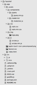
After downloading Fastshell to our “mylingulo” folder you will see a new folder “fastshell” which contains many different files and two folders. Have a look at the image to see all files and folders (click to enlarge).
The first and most noticeable fact is that there are two folders, one called “app” and one called “src” which contain many more files and directories. So what are those two folders for?
The app folder
The “app” folder holds your actual website, this is the folder you will be uploading to your server. It contains your HTML files, your images, optimized JavaScript and CSS files as well as libraries your website depends on. If you open up the folder you will see the following files and folders:
- apple-touch-icon-precomposed.png: this image will be displayed if an iPhone / iPad / iPod user saves your website to the home screen
- favicon.ico: this file will be displayed as Favicon (the little image at the left side of a tab in your browser) by Internet Explorer and some other browsers
- index.html: this is our main HTML file containing the HTML code
- assets: this folder contains four different folders which hold the assets of our websites; the “css” folder contains our production CSS code, the “img” folder contains our images, the “js” folder contains our production JavaScript files and the “components” folder contains vendor scripts / libraries our website depends on; by default two vendor scripts are included: jQuery and Modernizr
The src folder
The “src” folder contains – as the name states – the source files for your “app” folder. It contains JavaScript and SCSS (Sass) files which will be processed by our task runner Gulp and then saved inside the “app” folder. That’s the reason why we will not touch the “app” folder for any purpose except changing the HTML file and adding images. All changes in CSS or JavaScript will be performed from within the “src” folder. The “src” folder contains the development JavaScript and SCSS files. If we want to make changes to our JavaScript or CSS then we need to edit the JS and SCSS files inside the “src” folder. If you open up the folder you will find the following files and folders:
- js: this folder contains our JavaScript code which will be optimized by Gulp and then saved in the “assets” folder of the “app” folder
- scss: this folder contains our SCSS code, which is separated into multiple folders and files
- mixins: this folder contains SCSS mixins; mixins are a bit like functions, you can pass parameters and create groups of CSS declarations which can be used throughout your files; read more about mixins here
- _position.scss: this file contains a mixin which can be used to simply add a positioning declaration
- modules: this folder contains components (like for example buttons and input fields) as well as basic configuration modules (like typography or responsive breakpoints)
- _app.scss: this file contains general rules which don’t really fit into any other file
- _breakpoints.scss: this file contains the media query breakpoints for adapting the website’s layout on different screen sizes
- _buttons.scss: this file contains the Sass rules for our buttons
- _clearfix.scss: this file contains a clearfix, which is a way to clear a floating that has been set by the
floatproperty - _defaults.scss: this file contains basic defaults like the default font size and background color
- _inputs.scss: this file contains the Sass rules for our input fields, textareas and other inputs
- _lists.scss: this file contains the Sass rules for our lists
- _misc.scss: this file contains miscellaneous Sass rules
- _normalize.scss: this file contains our CSS reset rules, it reduces browser inconsistencies in default values like line heights which can differ from browser to browser
- _print.scss: this file contains a media query for creating the print version of your website
- _typography.scss: this file contains our default typography settings like font family or font weight
- _vars.scss: this file contains our variables, which can be used in any other Sass file; use variables whenever you use a specific value in multiple places inside your files
- partials: this folder contains files for the different parts of our website (for example the header, the navigation or the sidebar)
- _footer.scss: this file contains rules for the website’s footer
- _header.scss: this file contains rules for the website’s header
- _main.scss: this file contains rules for the main content part of our website
- _nav.scss: this file contains rules for the main navigation of our website
- _sidebar.scss: this file contains rules for the sidebar of our website
- vendor: this folder contains Sass rules which are taken from external sources and are not created by us
- _external.scss: this file contains all rules from external sources
- style.scss: this file imports all other files; if we add another Sass file we need to import it into this file
- mixins: this folder contains SCSS mixins; mixins are a bit like functions, you can pass parameters and create groups of CSS declarations which can be used throughout your files; read more about mixins here
Note that the structure above is the default structure of Fastshell. Of course we can remove existing or add new modules and partials depending on the structure and features we need for our project.
By the way there are many different approaches on how to structure a Sass project. If you are building a larger project it is a very good idea to further subdivide your files into new folders. So you would for example create a folder “forms” which contains different files for all your different forms. If you want to know more about creating a Sass architecture which fits your needs check out this guideline.
Hidden files
Apart from the “app” and “src” folders there are also some other files. In order to see all files you need to make sure hidden files are visible on your system.
If you are using Mac and you don’t see files starting with a dot please open a terminal, add this command and press Enter: defaults write com.apple.finder AppleShowAllFiles YES
If you still don’t see hidden files you might need to restart your computer.
If you are using Windows displaying hidden files depends on the Windows version you are using. If you don’t see hidden files please follow these instructions to make them visible.
Now that you should see hidden files let’s have a look at all the files which are not inside the “app” or “src” folder:
- .editorconfig: with this file developers can set defaults for settings like the charset or the size of indents; some IDEs or editors can then adapt their settings according what the developer has set in this file; if you want to find out more about it check out this website
- .gitignore: this file lists all the folders and files that should be ignored by GIT; if you ignore a file or folder it won’t be added to the GIT repository; it makes sense to ignore dependency caches (like the “node_modules” folder), files that are generated at runtime (such as
.tmpor.lockfiles) or hidden system files (e.g.Thumbs.db). - .jshintrc: this file is the configuration file of JSHint, a JavaScript error detection tool; find out more about the different configuration options here
- .travis.yml: this file is the configuration file of Travis, a way to test code before deploying it
- DOCS.md: this file contains the documentation of Fastshell to be displayed on Github
- gulpfile.js: this is the configuration file for Gulp.js, our JavaScript task runner; in this file we can define which tasks should be performed and define settings for each of the tasks
- package.json: this file is the configuration file of NPM, the Node Package Manager; inside we define the name, author, repository etc. of our project as well as the dependencies our project has; whenever you use the
npm installcommand the new package will be added to this file
If you are a bit confused now don’t worry. In this tutorial we are only going to do changes to the files in the “app” and “src” folders as well as the package.json and the gulpfile.js.
Understanding the package.json
The “package.json” is a configuration file in JSON format which holds information about the name, author, version etc. as well as the dependencies of our project. This is useful especially for projects which will be published as it allows other people to install all the dependencies of your project by simply typing in npm install. But even if you are building a private project it makes sense to use a “package.json”. Why? Because it takes care of your dependencies for you. Say you want to use a great plugin and that plugin needs to load multiple other frameworks, libraries or plugins in order to work. Instead of manually downloading those other files npm will take care of that. All you have to do is add the great plugin you want to use as a dependency into your “package.json”, run npm install and npm will do the rest.
npm is a great way to install new packages and make sure all required dependencies are available. In the past npm used a nested dependency tree meaning this: imagine our website requires “jQuery” in version 3.0.1 to work while “package B” (for example some slider plugin) requires “jQuery” in version 1.5.1. With nested dependencies we would have both versions installed. Version 1.5.1 will only be available to “package B”, no other package will be able to access it. Nested dependencies are more complicated and often install certain dependencies multiple times. So you might end up with 10 versions of jQuery which also results in more disk space and can be confusing. If you want to read more about nested dependencies, their advantages and disadvantages and the differences compared to flat dependencies check out this post.
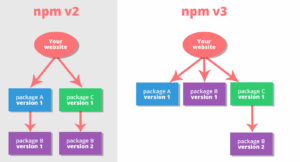
npm decided to move from a nested dependency tree to a more flat dependency tree when they launched npm v3. What this means is that npm will try to install dependencies in the same directory as the dependency and not nested inside of it. Let’s check out an example, please have a look at the diagram image on the right side. As you can see in the example your website requires “package A” in version 1 and “package C” in version 1. “Package A” requires “Package B” in version 1 while “Package C” requires “Package B” in version 2. In npm v2 the packages are installed in a nested way meaning “Package B” (version 1) is installed inside “Package A” (version 1) and “Package B” (version 2) is installed inside “Package C” (version1). In npm v3 however npm tries to install packages at top level. So as you can see “Package B” (version 1) is installed in the same level as “Package A” (version 1). Now “Package C” needs to have “Package B” (version 2) as a dependency. But since we can not install the same package in a different version at the same level we have to nest “Package B” (version 2) inside “Package C”. The advantage of the npm v3 approach is that any package at the top level is now able to access “Package B” (version 2) and we don’t need to install the same package multiple times. Because imagine what happens when we have another package called “Package D” and this package requires “Package B” (version 1). In npm v2 we would need to again install this dependency inside “Package D”. In npm v3 however since we already installed the dependency at the top level we don’t need to nest it inside the new package anymore.
Now let’s open up the “package.json” and have a look at its contents. As you can see it contains a JSON string with keys and values. First, general settings like the name, title, author, version and GIT repository are added. Then we have a section devDependencies holding the information on which plugins our project depends on when developing.
- name: the name of the project (required) – read more
- title: human-readable title of the project
- author: the name of the author (probably you) – read more
- url: the URL of the project
- version: the current version of the project (required) – read more
- license: the license under which to place the project – read more
- repository: the type and URL of your repository; if your project is not going to be publicly available you can omit this – read more
- devDependencies: this holds the names and versions of all the dependencies we need for developing; it should however not contain dependencies our finished product requires (like Bootstrap for example) – read more
- browser-sync: this tool helps you by automatically updating your browser window when a change occurs in your files – read more
- gulp: this tool is our task runner which can run other tools and help you by doing tasks like minifying your CSS automatically – read more
- gulp-autoprefixer: this tool adds vendor prefixes to your CSS rules in order to allow cross browser support of certain CSS properties – read more
- gulp-cssnano: this tool minifies your CSS in order to reduce file size and thereby improve page loading time – read more
- gulp-header: this tool adds a header to a file holding information about e.g. the version, the name and the author of the file – read more
- gulp-jshint: this tool helps you detect errors and problems in your JavaScript code – read more
- gulp-rename: this tool allows you to rename files automatically – read more
- gulp-sass: this tool compiles your SASS files CSS in order for them to be understandable by the browser – read more
- gulp-sourcemaps: with this tool you will be able to debug your CSS and JavaScript code even after it has been optimized for production – read more
- gulp-uglify: this tool can minify your JavaScript code in order to reduce file size and thereby improve page loading time – read more
- gulp-util: this is a plugin which adds utilities allowing you for example to change the color of error warnings in the command prompt – read more
- jshint: this is required to load in order for the “gulp-jshint” tool to work (since version 2.0)
Next to each package in the “devDependencies” section you can see a version number preceded by a caret. The caret tells npm to install the packages up to the most recent minor version. What this means is that the packages will be installed to the most recent version without changing the first non-zero digit. So adding a version of ^1.2.3 updates your package to a version of >= 1.2.3 and < 2.0.0 . Adding a version of ^0.2.3 updates your package to a version of >= 0.2.3 and < 0.3.0. And adding a version of ^0.0.3 will result in installing the package at a version >= 0.0.3 and a version < 0.0.4 (because as mentioned the last digit which is not zero will not be changed when using carets). People add carets because they don’t want to allow major updates which will do a lot of changes and thereby often create errors.
If you ever want to create a “package.json” from scratch, for example for a project where you don’t use a workflow framework like Fastshell you can use an online generator.
Now that you have an overview of the contents of the “package.json” file you can change the name, author, url etc. according to your needs.
Installing the dependencies
It’s time to install our development dependencies which are listed inside the “package.json” file. To do so we open up our command prompt / terminal again, we type in npm install and press Enter. In the command prompt you can now see your packages downloading. This can take some time depending on your internet connection. Once finished go back to your “fastshell” folder and have a look at the newly generated folder called “node_modules”. This folder now contains all the packages which we have added inside our “package.json” file as well as their dependencies. And since we are using npm v3 with a flat dependency tree a lot of dependencies are added to the very root of the “node_modules” folder. That’s why you will see hundreds of different dependencies inside.
Now that we have installed all dependencies we are ready to configure and start our development tools.
Understanding the gulpfile.js
The “gulpfile.js” is the configuration file for the Gulp task runner. In it we can define different tasks which can be triggered using the command prompt.
Requiring packages
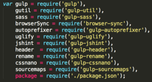
Let’s open it up and have a look at its contents. At the very top you will see multiple variables requiring packages. This is done in order to be able to use the packages inside our “gulpfile.js”. By requiring them and defining variables for each package we now can use the variables to run tasks. Note how we also require the “package.json” file in order to use its contents for creating the header banner for our JavaScript and CSS files.
Setting the header banner
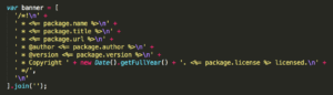
After that a variable banner is set which defines the header for our JavaScript and CSS files. This header banner will be added to the very top of our CSS and JavaScript files. Have a look at how we can use the package variable to simply access the contents of the JSON encoded “package.json” file.
The css task
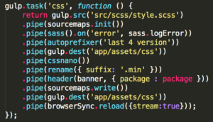
The next part shows the actual main concept of Gulp. You can create tasks which perform certain jobs you can define as you like. So let’s have a look at our first task. The first task is called “css” and does different jobs for optimizing CSS code. By using gulp.src('src/scss/style.scss') we define the source file we are going to work with. In our case this is the “style.scss” file as this file imports all our SASS files. The gulp.src() turns our path into a readable stream of data which we are then piping through our different tasks using pipe(). So using pipe() we can chain multiple tasks together. To find out more about pipe(), streams and the difference between Gulp and other build systems please read this article (it’s short and great).
The first task we run on our source file is sourcemaps.init(). This task initializes our Sourcemaps. As mentioned before Sourcemaps are a way to allow debugging of files which have been processed already. So by adding the init() task at the very beginning Sourcemaps are “listening” for any filters which may change which line some piece of code lives on. Then after all the tasks have finished which change the position of CSS code in our files the sourcemaps.write() task will start creating the Sourcemaps. We will now be able to debug in the browser and find the correct position in our code. If this seems complicated don’t worry as we will work with Sourcemaps later in this tutorial and you will understand.
The next task sass().on('error', sass.logError) compiles our source file (“style.scss”) into CSS and logs any error which might occur. By running the autoprefixer() task next we let Autoprefixer add vendor prefixes to the just generated CSS code. If you are using new CSS features like Flexbox or features that require different properties in different browsers the Autoprefixer takes care of making sure your rules work in any browser. As an example if you add this code to your CSS:
#foo
{
  display: flex;
}
and then you run the Autoprefixer you will get this:
#foo
{
  display: -webkit-flex;
  display: -ms-flexbox;
  display: flex;
}
Autoprefixer automatically added vendor prefixes to enable the use of Flexbox in a larger amount of browsers.
If you have a look at the “Gulpfile.js” again you can see that Autoprefixer takes an argument which is “last 4 version” in our case. What this means is to add vendor prefixes for the last four versions of all browsers. You can also add vendor prefixes for specific browsers only, check this out for more information on what versions you can specify.
After autoprefixing the next task is gulp.dest('app/assets/css'), which saves the generated CSS code at the location “app/assets/css” with the same file name but with a different file extension. So instead of style.scss the new file is now called style.css (since we don’t have SASS code anymore but CSS). Gulp has now created a non-minified CSS file with our SASS rules compiled to CSS.
Now it’s time for Gulp to improve the CSS code further by minifying it for production use. The Gulp task cssnano() does exactly that. Since the new file is supposed to be called “style.min.css” we use rename({ suffix: '.min' }) to add the suffix “.min”. Btw using suffix as a parameter inside the rename() function tells Gulp to add “.min” just before the file extension.
Next we want to add the header banner to our “style.min.css” file and we do so by calling header(banner, { package : package }). Note how we pass the variable “package” containing our “package.json” to the header() task as well as the banner which defines the way our header should look like. Remember we defined the banner in line 15 in the “Gulpfile.js”.
By again calling gulp.dest('app/assets/css') the newly generated CSS file is saved in the same location as before. However the file name isn’t “style.css” but “style.min.css”.
The last job inside our “css” task is the browserSync() task. As you can see in line 57 there is a task which initializes BrowserSync, a tool to enable auto reloading of your assets whenever they are changed. Just like before a new task is generated using gulp.task() and then the name of the task is added inside the brackets as well as a function with the actual behavior. So inside the “browser-sync” task BrowserSync is initialized by passing our base directory (the “app” folder). We could also add a proxy if we wanted to. Check out the different configuration options of BrowserSync.
So let’s move back into our “css” task. By writing browserSync.reload({stream:true}) we are telling BrowserSync to inject the newly generated CSS files into our locally hosted website. That way whenever the “css” task is running any changes that occurred in our CSS will be automatically updated in our browsers. Note that BrowserSync’s syntax has changed a bit so we need to change the line .pipe(browserSync.reload({stream:true})); to .pipe(browserSync.stream()); in order to support upcoming versions of BrowserSync.
The js task
That’s it for our “css” task, let’s have a look at the “js” task now. Again we use gulp.src() to get our source file and return a stream which we can then pipe through our plugins using pipe(). In this case our source file is the “scripts.js” file inside the “src/js” folder. Just like before we initialize Sourcemaps to enable debugging on production files. Next we run jshint() passing the path to the JSHint configuration file .jshintrc which you can use to define general settings like the ECMAScript version or whether to use strict mode or not. Note that some options inside our configuration file are deprecated and need to be removed in order to support the next versions of JSHint. To see which options are not supported anymore have a look at all the options.
So let’s open up the .jshintrc file and do the following changes: First let’s replace the es5 option as well as the esnext and replace it with the new esversion option. So please remove "es5": true, and "esnext": true, and replace it with "esversion": 6, to tell JSHint to use ECMAScript 6. Next let’s completely remove the lines "camelcase": true, and "immed": true, and "indent": 2, and "newcap": true, and "quotmark": "single", and "regexp": true, and "trailing": false, and "smarttabs": true, since these options are not supported anymore.
Your .jshintrc should now look like this:
{
  "node": true,
  "browser": true,
  "esversion": 6,
  "bitwise": true,
  "curly": true,
  "eqeqeq": true,
  "latedef": true,
  "noarg": true,
  "undef": true,
  "unused": true,
  "strict": true,
  "globals" : {
    "jQuery": true,
    "Modernizr": true
  }
}
JSHint is soon or later going to remove any options, that help for a good and consisting code style. If you want to make sure to further check your JavaScript for bugs and coding style mistakes please have a look at ESLint.
Let’s move back to our “js” task. The next line jshint.reporter('default') defines the JSHint reporter we want to use. The reporter basically reports any errors or warnings you might get when JSHint checks your JavaScript code. You can change the looks of your reporter so that the reports appears more clear to you. Check out for example JSHint Stylish which is a stylish reporter you can use. You could also create your own reporter if you like. In our case we just want to use the default reporter though.
Next just like before we add a header to our file and then save it at the location “app/assets/js”. The file name will be the same as the source file, so “scripts.js”. After saving the uncompressed version of our scripts we run uglify() to minify our code using UglifyJS2. The code will now be unreadable for us but thankfully we used sourcemaps so we will be able to debug our code.
The next line 'error', function (err) { gutil.log(gutil.colors.red('[Error]'), err.toString()); } makes sure to display an error message in case an error occurs and by using the Gulp utility tool we change the color of the error to red.
The next step is to add the header again. Why again? Because uglify() has removed any comments in the JavaScript code and thereby also removed our header. By adding it again we make sure the header is also added to the minified version.
Next the file is renamed just like the CSS and a suffix “.min” is added. The final file name is then “scripts.min.js”.
Now that all jobs which might change the position of a piece of code are finished the sourcemaps.write() job starts writing the sourcemaps. We will see later what a source map looks like and how we can use it.
Using the gulp.dest() job the newly created minfied JavaScript code is saved in our “app/assets/js” folder.
The last line browserSync.reload({stream:true, once: true}) injects the updated JavaScript code into our browsers. That way any change we did in the JavaScript file will be automatically applied in all our browsers without the need of a manual refresh. Just like for the CSS we need to change the code in order to comply with the new version of BrowserSync. To do so please change the line .pipe(browserSync.reload({stream:true, once: true})); to .pipe(browserSync.stream()); and save the file. By passing once:true to the stream() function we could make sure the reloading occurs only once per stream but since we are only processing one single file (“scripts.js”) there is no need to add that.
The bs-reload task
The next task in our “Gulpfile.js” is the “bs-reload” task. What this task does is simply run browserSync.reload(); which does a hard reload of the page. So instead of elegantly injecting code into the page this job reloads the whole page. This is necessary for any HTML changes we do to our files.
The default task
Let’s have a look at our last task, the “default” task. The “default” task is triggered whenever we run Gulp without any parameters in our command prompt. To run a Gulp task we could go into our command prompt and type in for example gulp css which would run the “css” task. Or gulp browser-sync if we just wanted BrowserSync to initialize. However if we don’t add any parameter after the gulp command the default task will be executed.
As you can see our “default” task has a third parameter ['css', 'js', 'browser-sync'] containing an array of three other tasks. What this does is make sure those three tasks will run first and only after that the “default” task will execute. The “default” task contains multiple watch() jobs. A watch() job – as the name states – watches files and triggers a task whenever a certain file is changing. In order for Gulp to know which files to watch and what to do if a file changes we define multiple watch() jobs watching different directories and running different tasks when files change. We can use asteriks in the file paths to allow for matching of multiple files or directories. Note that one asterik means “anything in the current directory” while two asteriks mean “anything in this or any child directories”. So by defining gulp.watch("src/scss/**/*.scss", ['css']); we tell Gulp to watch any files which have a file extension “.scss” and are inside the “src/scss/” folder or any child folder. Whenever a change in one of the files happens the “css” task will start running.
We do the same thing for any JavaScript files in the “src/js” folder with the line gulp.watch("src/js/*.js", ['js']); and run the “js” task if a change occurs. And we do the same thing for any HTML file changes inside the “app” folder by using gulp.watch("app/*.html", ['bs-reload']); and run the “bs-reload” task which will simply reload the browser to make any change in the HTML files visible to us.
Running Gulp
You should now have a basic understanding of what Gulp is and how it can help us develop web projects faster and produce better results. It’s time to launch Gulp now and see whether everything works fine without any errors.
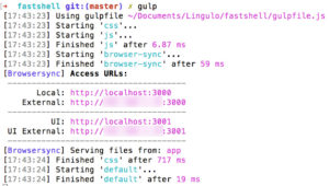
Type in gulp into your command prompt and hit Enter. Now Gulp will start working and you will see exactly what it does. As you can see first the “gulpfile.js” is used to read its contents. Then the different tasks we defined to run by default will start. Note that you can see some tasks start later but end earlier while others start early and take more time. Since Gulp uses streams one pipe() is starting before another pipe() has finished.
You will also see Browsersync’s local and external URL which you can use to access the website we are building. The first URL (ending with port 3000) gives you access to our project while the second URL (ending with port 3001) lets you define some settings for Browsersync.
Once Gulp has finished working a new browser window should open magically and you should see what our website looks like at the moment. Try to add some text to the index.html file and save it. Move back to the browser and your page should have automatically reloaded. That’s the great thing about BrowserSync, you can work on a file, save it and the changes will be available in the browser without having to do a manual refresh.
How to start coding
We have prepared our development tools and front-end boilerplate. Let’s now start thinking about the next steps. There are different approaches to coding but I will teach you my personal preference.
A good concept helps
In a very first step think about what you want to create. Think about the layout of the page, the colors and the style. Should the website have a one-page layout with just one single page or should there be multiple pages? What sections should the page have and how should they be aligned to each other?
Especially when creating a client website it is a good idea to first create a basic mockup / concept of the page and show it to the client. That way you both know what you are talking about and how the end result should look like. There are many different tools out there which you can use to create mockups in a simple way. Personally I use Macaw but you could use any other similar program or even Photoshop or Gimp.
Creating a mockup can help you later when building the HTML structure. Because since you already have an image of what you want to accomplish you can easier build the HTML code. For some parts of your website like the navigation or the logo it suffices to add a text to your mockup explaining what it should represent. In my concept I have done this for the logo (since I don’t have a logo yet) and the navigation (since at that time I didn’t know yet exactly what it should look like). Once you have your mockup ready it will be much easier to determine for example which HTML 5 sectioning elements to use for the different parts of your page.
Have a look at the concept I created which shows the layout of our final website. Note that the process of creating a concept is actually pretty fast if you have a good tool and if you have made some experience with it.
What is and why use semantic HTML?
Now that we have a basic overview of what we want to create it’s time to think about how to transform the concept into something that can be read and interpreted by computers, softwares or bots and then outputted to a human.
HTML (Hypertext Markup Language) is – as the name states – a markup language for hypertexts. Hypertexts are basically texts with dynamic structures which can contain links to other hypertexts and don’t need to be read like a book in a sequential order. Markup language is a way for machines to understand the structure und formatting of a text document. Because a website is basically nothing else than a piece of text wrapped in different markup tags and some CSS styling to make the text look good for humans. By using a markup language we can give machines more information on what kind of information a piece of text contains. Because machines can not (yet) think like humans they will not be able to understand a text by themselves. So it is our job to make them understand the contents of our hypertext. We do that by wrapping our hypertext into appropriate tags which can tell a machine about the type of text it contains.
Prior to HTML 5 structuring a hypertext document in a way that it could be understood by machines wasn’t really possible. There were just too few different tags that could be used to add a structure. Thankfully with HTML 5 we have a much larger variety of different semantic tags and can choose the appropriate ones. Semantic means that the content is clearly defined. A nav tag for example will for sure have a navigation inside. Non-semantic elements in contrast don’t say anything about their contents. A div can be used for anything, a navigation, a piece of text or just for creating a layout. Using semantic elements will make machines understand better which part of your website contains which kind of information. This not only helps search engines to better perceive information since they know exactly which parts of your website are relevant and which aren’t. It also helps handicapped people to use your website much easier and faster. For instance because screen readers will know which part of your website to read out. They will know where the navigation lies which makes navigating much quicker and easier for the user.
Let’s have a look at some of the most important semantic HTML 5 tags for structuring a web page.
- article: specifies independent content which should make sense even if you take it out of context; a blog post like this post on Lingulo could for example use this element
- section: defines a section in our document, a part of contents that somehow belong together; if you have a look at my concept we could use this element for each of the sections with a different background; compared to other sectioning elements like the
navelement the use of thesectionelement is less precise and strict - header: defines a header for the whole document or just for a section depending on where you add it; so you could add a
headerinto anarticlefor instance, theheaderwill then count as the header of only thatarticle; aheadershould contain introductory content like for example the heading and an introduction sentence of anarticle - footer: defines a footer for the whole document or just for a section depending on where you add it; a footer of the document could for example contain links to the privacy policy or copyright information; if added to another section like an
articlethe footer should contain content concerning thatarticle, for example author information - nav: defines a block of navigation links; you could have multiple elements on your page for example for the main navigation and the footer navigation
- aside: defines some content aside from the main content like a sidebar; if added inside another sectioning element the
asideshould have content related to the surrounding element’s content; - figure and figcaption: a
figureelement contains an image, a diagram, a video, an audio file, code blocks etc.; afigureelement represents a self-contained piece of content, so if you take the element and put it somewhere else in your code the document’s meaning would not change. Afigureelement can have afigcaptionwhich is supposed to be the caption of thefigure
There are some more new semantic elements in HTML 5, have a look at the full list here. HTML 5 now offers a large variety of different semantic tags which you can and should use to better structure your web page.
Coding in the browser
As soon as we have created and verified our HTML 5 code structure the next step is to add styling to the HTML code. We do that by adding CSS rules which will tell the browser how to render the different HTML tags. Because we want to be able to see what we are doing my personal preference is to code directly inside the browser. Since we are using Sourcemaps this is not a problem even when using SASS as you will see later. So instead of working in your code editor, saving, switching back to the browser to see the results, then finding out the margin should be a few pixels more, switching back to the code editor, changing the pixels, saving, switching back to the browser… all we do is use the Developer Tools, see live changes without having to switch between programs and set the pixel value to exactly what we want. Then saving the change will make sure the files are overwritten with the changes we made in the browser.
In this tutorial I am going to use Google Chrome and the Developer Tools but the same thing should work with other browsers like Firefox as well. However if you want to follow exactly what I am doing it makes sense to also use Chrome since my instructions will be based on Chrome.
As mentioned before we are going to use Bootstrap as a CSS framework. Since Bootstrap is not part of Fireshell we need to make sure to install the framework.
Installing new dependencies: Bootstrap
As we are using the Node Package Manager installing new dependencies is very simple. First we go to the npm website, search for a package “bootstrap” and click on it. We should now be on this page: https://www.npmjs.com/package/bootstrap
On the right side you will see the install command which you can copy by clicking on it. Then go back to the terminal. Currently the terminal points to the “mylingulo” folder, however we need to change the directory to the “fastshell” folder. To do so simply enter cd fastshell. Then paste the copied text snippet into the terminal window (npm i bootstrap). Press enter and npm will start installing bootstrap and its dependencies into the “node_modules” folder.
If everything worked fine you should see something like “added 1 package from 2 contributors”. When you open up the “package.json” you will see a new entry “dependencies” with just one package.
While “devDependencies” defines the packages we only need for the development of our website “dependencies” contains the packages needed for the actual website. Right now we only have one entry “bootstrap” as a dependency of our project. However you might add additional packages later in order to add additional functionality or features.
Importing Bootstrap
Bootstrap has been installed as a package now. Right now this doesn’t let us use any Bootstrap features as we still have to import the Bootstrap styles and scripts into our project.
Importing the Bootstrap styles
If you open up the “node_modules” folder and then go into the “bootstrap” folder you will see a folder “scss” containing many different SASS files. Bootstrap puts styles for different modules into different files. All those files are then imported into one file which is the “bootstrap.scss” file. So all we have to do is import that file into our own SASS file in order to use the Bootstrap CSS rules.
Please note that it might make sense to not import the whole file but instead only import the parts you really need. For example if you only need the grid system and the typography then it doesn’t make sense to import the table styles. By choosing only the “scss” files you really need you can make sure to reduce the file size of the generated CSS file. You can read more about it on the Bootstrap website. However in this tutorial we will import everything for the sake of simplicity.
To import the Bootstrap styles open up our “style.scss” file in “fastshell/src/scss/” and add a new @import rule importing the “bootstrap.scss” file. I would recommend to import the Bootstrap file after the “Config modules” section but before the “Partials” section. That way we can set Bootstrap variables in the “_vars.scss” file (they need to be set before Bootstrap is imported) and any SASS code we add to one of the files in the “Partials” section or after that will not be overwritten by Bootstrap.
@import '../../node_modules/bootstrap/scss/bootstrap.scss';
When you run the “gulp css” task now in the terminal and then look at the generated “style.css” file in “app/assets/css/” you will see that the Bootstrap CSS code has been added to our CSS file. We could now use the Bootstrap classes in our project.
Importing the Bootstrap scripts
Apart from the Bootstrap styles we also need to import the Bootstrap scripts in order to be able to use features like for example the Carousel. Again we can either decide to import one file including all available scripts. Or we can manually import only the scripts we actually want to use. Have a look at “node_modules/bootstrap/js/dist” to see all of Bootstrap’s available JavaScript files.
For the sake of simplicity we will import one single file which includes all available plugins. This file is located in “node_modules/bootstrap/dist/js/bootstrap.min.js”. But before we can start adding the JavaScript file to our “js” task in the “gulpfile.js” we first need to install jQuery.
As stated on the Bootstrap website all plugins depend on jQuery. So in order to use the plugins we need to make sure to install and add jQuery. As we are using the Node Package Manager (npm) we can use this simple command to install jQuery:
npm i jquery
In case you would like to use dropdowns, popovers or tooltips you also need to install Popper.js. You can do that by simply running npm i popper.js. However in this tutorial we don’t need the library as we are not going to create dropdowns, popovers or tooltips.
Now that we have installed jQuery we can start adding jQuery and Bootstrap to the “js” task of our “gulpfile.js”. That way they will be added to the generated JavaScript file. We just need to make sure to add them in the right order. As Bootstrap requires jQuery we first need to add jQuery, then Bootstrap and then the “scripts.js” which holds any custom JavaScript code we eventually wrote.
Open up the “gulpfile.js” and look for the “js” task. You will see one single file “src/js/scripts.js” as the source file. We now want to add two additional files to the source so we need to add an array into the “.src()” function. We do this by adding square brackets into the function and then add the scripts separated by a comma like so:
gulp.src([
  'node_modules/jquery/dist/jquery.min.js',
  'node_modules/bootstrap/dist/js/bootstrap.min.js',
  'src/js/scripts.js'
])
Instead of one single file we are now importing jQuery, Bootstrap and our “scripts.js”. However we will experience a problem now. Try running the “js” task by writing gulp js into your terminal. You will see many errors thrown by JSHint, our JavaScript code quality tool. JSHint is telling us that there are some syntax problems in the jQuery and Bootstrap JavaScript files. This occurs because Bootstrap and jQuery are using different approaches on how to write clean JavaScript code. But as we don’t want to do any changes to the jQuery and Bootstrap files and don’t really care about those errors it would be best to tell JSHint to ignore them and only care about our own code.
We can do this by creating a new file with the file name .jshintignore in the root of our project (where the “gulpfile.js” is also located). Then inside that file we can add any files we want JSHint to ignore. As we don’t want JSHint to validate any files inside the “node_modules” folder we can simply add this to our newly generated file:
node_modules/**
This tells JSHint to ignore any file in any folder inside “node_modules”. If you run the “js” task again it should now run successfully.
Updating our dependencies
Before we start coding let’s update all our dependencies listed in the “package.json” file. It is important to periodically check the dependencies of your project for outdated packages. This is necessary in order to fix known security vulnerabilities. This is especially important for the “dependencies” section in your “package.json” since those packages are available to the public.
To update your dependencies you would either need to run npm update for each dependency in your “package.json” file (takes ages) or you can use a tool like npm-upgrade which automatically checks either a specific or all packages for updates. To install the tool simply run npm i -g npm-upgrade which installs “npm-upgrade” as a global package so you can use it from anywhere on your system.
Once the installation is complete in your terminal (which of course still needs to point to the root of your MyLingulo project just like before) type npm-upgrade. Now the tool checks each of your dependencies and asks you whether you would like to update the dependency. You choose “Yes” and click Enter for each dependency. Once done the tool is asking you whether it should update the “package.json” file. Type in “Y” and click Enter to confirm updating the “package.json”.
Now the “package.json” has been updated however our new dependencies have not yet been installed. To install the new versions and remove the old ones we just type in npm install (you can also just type in the short version npm i).
Upgrading our Gulpfile
After upgrading all our dependencies you will realize that we also upgraded Gulp from version 3 to version 4. So right now when running gulp in your terminal you will get an error. This is because some things have changed in Gulp 4 and we need to make adaptions to our “gulpfile.js” in order to make it work with the new Gulp version. I followed this guide to successfully upgrade the “gulpfile.js” to version 4. You can either try the same or copy the following updated “gulpfile.js”. Please note I marked all lines where I have changed code so you can better see what exactly changed.
var gulp = require('gulp'),
    gutil = require('gulp-util'),
    sass = require('gulp-sass'),
    browserSync = require('browser-sync'),
    autoprefixer = require('gulp-autoprefixer'),
    uglify = require('gulp-uglify'),
    jshint = require('gulp-jshint'),
    header  = require('gulp-header'),
    rename = require('gulp-rename'),
    cssnano = require('gulp-cssnano'),
    sourcemaps = require('gulp-sourcemaps'),
    package = require('./package.json');


var banner = [
  '/*!\n' +
  ' * <%= package.name %>\n' +
  ' * <%= package.title %>\n' +
  ' * <%= package.url %>\n' +
  ' * @author <%= package.author %>\n' +
  ' * @version <%= package.version %>\n' +
  ' * Copyright ' + new Date().getFullYear() + '. <%= package.license %> licensed.\n' +
  ' */',
  '\n'
].join('');

gulp.task('css', function () {
    return gulp.src('src/scss/style.scss')
    .pipe(sourcemaps.init())
    .pipe(sass().on('error', sass.logError))
    .pipe(autoprefixer('last 4 version'))
    .pipe(gulp.dest('app/assets/css'))
    .pipe(cssnano())
    .pipe(rename({ suffix: '.min' }))
    .pipe(header(banner, { package : package }))
    .pipe(sourcemaps.write())
    .pipe(gulp.dest('app/assets/css'))
    .pipe(browserSync.reload({stream:true}));
});

gulp.task('js',function(done){
  gulp.src([
    'node_modules/jquery/dist/jquery.min.js',
    'node_modules/bootstrap/dist/js/bootstrap.min.js',
    'src/js/scripts.js'
  ])
    .pipe(sourcemaps.init())
    .pipe(jshint('.jshintrc'))
    .pipe(jshint.reporter('default'))
    .pipe(header(banner, { package : package }))
    .pipe(gulp.dest('app/assets/js'))
    .pipe(uglify())
    .on('error', function (err) { gutil.log(gutil.colors.red('[Error]'), err.toString()); })
    .pipe(header(banner, { package : package }))
    .pipe(rename({ suffix: '.min' }))
    .pipe(sourcemaps.write())
    .pipe(gulp.dest('app/assets/js'))
    .pipe(browserSync.reload({stream:true, once: true}));
  done();
});

gulp.task('browser-sync', function(done) {
    browserSync.init(null, {
        server: {
            baseDir: "app"
        }
    });
    done();
});
gulp.task('bs-reload', function (done) {
    browserSync.reload();
    done();
});

gulp.task('default', gulp.series('css', 'js', 'browser-sync', function (done) {
    gulp.watch("src/scss/**/*.scss", gulp.series('css'));
    gulp.watch("src/js/*.js", gulp.series('js'));
    gulp.watch("app/*.html",  gulp.series('bs-reload'));
    done();
}));
As packages are updated regularly this is something that every professional web developer has to deal with. Often updating a project’s dependencies is not only about updating the dependencies itself but also requires additional manual adjustments that can sometimes take long time.
Creating the website
We finally managed to get to the point where we can actually start coding, haven’t we? 
Well, almost..!
When I started creating web projects for clients many years ago I was always pretty impatient and wanted to start immediately because I had many good ideas in my head. So I started coding, creating and designing the website on the fly and spending ages making sure every pixel is at the exact right position. Then after many hours I showed the website to the client and they said: “it’s nice, but we want to the navigation to be rather here and we don’t like this burger menu. Oh and we don’t want a slider, we don’t have good images. Could you also please change the colors, I don’t really like them. And we also want the website to be full-width, not boxed.”
So I ended up basically rebuilding the whole website which took about as long as it would creating it from scratch.
Will be continued soon…
The post How to build a responsive website the professional way appeared first on Lingulo.com.


